
I have decided not to continue working on this brief. I have spend far too long (3 weeks so far) on this brief without moving forward, or feeling remotely engaged with the subject matter.
I set out for this brief to be a full promotional campaign for the brand, two weeks max from start to finish, but this has not been resoled in the time allocated and despite this i carried on working on it. I feel i have reached the point where i am stuck with what i am proposing, I have spend too long on messing around on designs sheets wit different ideas and layout instead of simply getting on with it and putting my designs into practice - this has hindered me greatly and i now feel unmotivated to take this brief further.
I found working to the stick male audience a challenge, and i didn't when i set out to do this brief initially how hard it would be. I didn't want to make my designs overly sexual or tacky or the stereotypical lads format. This is where i when wrong, i wanted to change to many things and as a result i didn't research my audience fully. Hence the designs which i was produced tacked depth and concept.
From this point onwards i will spend my time which i was going to spend on the rest of this brief called Midnight Mode, which is alive music promotion brief. This will be engaging more with and be more beneficially to my FMP.
Sunday, 21 March 2010

Final Burst shots

After photoshop correction with color balance:

Varying the birds-eye shot as cropping in sections look more appealing and interesting. It draws the viewer in as they want to find out what it is.
MORE SHOTS
FINAL SHOT
After having the poster design finalized, i wanted to go back and play around with how i could incorerpate these mini bursts within the piece.
To match he concept of the leaflet and exhibition showcasing breakthrough talent, i decided that through the leaflet elements of the bursts could be cut out or cropped in the page frame or acting as the background - leading to once the leaflet has been read opening it flat out to reveal the A2 poster.
his concept works well as there is a build up of talent bursting through however it is only when the poster is opened out there is a burst which has finally broken through.

How the shot was set up and lit to take the best photo of the mini bursts:


Playing around with angles in which the shot was taken and lighting for shadows or not:


Saturday, 20 March 2010
End of year show developement
After playing around wiht the juxtaposition of how the text could be read to show off the 3D effect as much a possible, using cropped sections pieces togther I had a different idea.
Instead of the text being the main focal point, i wanted to change this to it being the shredded paper bursting through the letters, so the text would be partly illegible. I consdiered having the text re lazer cut out on a much larger sheet of paper and have the paper hanging off the bottom letters.


New lazer cut out letters, positioned in the top left hand corner to allow space for the shredded strips to hang and flow down to the bottom of the page.


Paper bursting through, however much more is needed to break the letters and hang out.

After position the hanging down paper strips, I didn't actually like the effect it was creating and i preferred the card color to be white instead. White provided a clean, crisp more positive effect to the piece which i think is lost when the card is black.
After scrapping this idea, I thought the design concept could be represented with more impact and in a simpler form.


I liked how the scrapped pieces looked when formed together in a ball shape clustered. To apply this to my design, i proposed to have this mass of paper simply pushing/bursting through a sheet of A2 paper and then taking it from there for the layout and applying the text for the event information etc.

Sample of how the paper looked all clustered together, nice mix of colour.


First shot of how it would look liek having the shredded bits brusting form behind a sheet of paper. The effect looked promising however it didnt look at 3D as i would liked it to of, and the paper literally just looked like a ball positioned in the hole instead of it being forced out as it is too full behind.

Editing the imagery in photoshop to brighten them up to see if that make a difference to the 3D visual elements. The result still looks fairly poor.
FILL IN CARD MOCK UP
The rips needed to be more defined, so i trailed using a thicker card to aid this, and the paper strips need to have larger thicker strips in too to make it look more visually appealing.
Using thicker card to make the rips more defined:


This did work, as the piece started to look as through the paper was bursting through effectively, however the shredded bits still lacked depth and vartity. So a cut out some different shaped to blend in with shredded strips:

Shapes which i made to be positioned within the burst (above).


This worked a treat! Much more visually appealing and interesting to look at. After crit feedback with Joe he said I should consider putting alot more different shapes within the burst to make it tactile and have more impact. I took this on board and here are the results:


Pleased wiht the developemtn and inpartcialurly how the close up shots of the design looked. The bridseye shots which is what i initially planned to have as the photograph on the poster has less imapct than these.
This was aided by in the close ups you could see more detail and the sharp points of the traingles bursting through - it looked more realistic and believable.


Playing with the triangles piercing the paper one at a time, very nice effect created:


After getting peer feedback from he people who were in my crit with me it was positive however some said that now the design looked far too busy. I agreed wiht this and decided that the shredded strips of paper were not needed to be in the foreground rather to act as a background and to focus my deisgn around the triangles and smaller shapes.
Refining and cleaning up the design burst:


Adding slightly more the burst:

Thursday, 18 March 2010
Quick mock up's of our own sets:


AS we were shooting everyone else's set, Lorenzo urged us to get out sets produced, or at least in mock up format so we could show the rest of the group what we meant by producing a set to convey your design practice and personality;
Above is rhiannes set shot, mine is below:


I started to refine mine as criritsim which i got from fred was that were was not enough of my own work present in it:

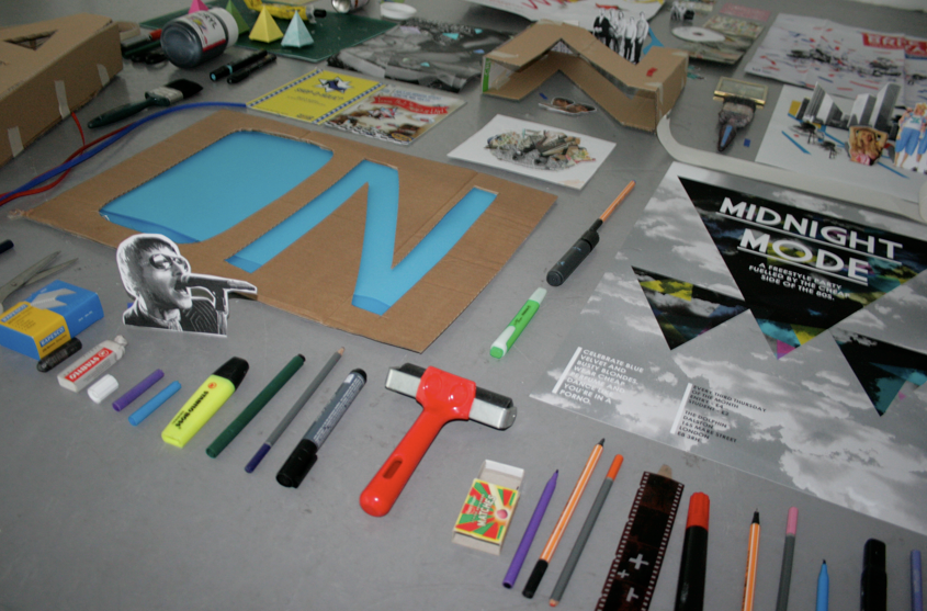


Refinement of Phil Armson set:


It was at this point that we knew we had out work out for us. It was going to be an extremely hard process to photograph each individual in the time which he had left as also to continue our own personal work throughout our FMP.
We had to be extremely strict with out time management and get all of the sets shot and out of the way preferability before the end ot easter in order to give patrick etc time to work on the layout.
here is he time slots which we allocated for each individual. each was give an hour slot after collage from 4pm -9pm which ran for two weeks:

Subscribe to:
Posts (Atom)