Friday, 4 June 2010

FMP Evaluation

This module has forced me to become organized and efficient with my time in order to reach the professional standard which I wanted to have on leaving this course. I feel that I have achieved this and I am pleased to say that I have advanced hugely with the quality of my design work compared to the last module before Christmas.

This has acted as motivation throughout my final major practice. Seeing the quality of my work developed and increase has spurred me on to push myself even further.
However a criticism to my organization skills would be I did not back up three of my briefs that I had been working on for my FMP. These were on my hard drive in the and last Saturday evening my hard drive became un recognized when plug into any usb port. As a result I have as far as I can see lost the final resolution to all of these briefs. This was a stupid mistake but luckily I had all of the final resolutions already printed so I hasn’t of yet caused too much of a problem.

I have achieved the majority of my goals that I set out initially at the start of this module. I have furthered my software skills in both illustrator and InDesign, to where I am now confident in using both including experimental format layout within InDesign.
It has been improving my software skills that I personally think has benefited me the most throughout this module. It has allowed me to contextualize my illustrations by placing them in a format that is suitable for each brief.  As a result my type and layout skills have improved dramatically and I have developed a good understand of incorporating grids when designing a layout.


In regards to my illustration I feel I have found my niche. By combining my hand craft and then digitally manipulating them via use of a camera or on screen has been the main process which I have incorporated within my designs this module, and in my opinion to great effect.
 However what I have realized when I making my sets for my design context, crafting large letter forms and geometric shapes is not for me. I didn’t enjoy joy the process as it was laborious and involved a lot of measurements and mistakes. As a result this was evident as the aesthetics of the set suffered.
 I realize now that I operate best on a small scale, allowing me to pay more attention to detail and it involves less mathematics, as a lot of it can be cut out by freehand.
In producing large scale sets for both my context and the year book set shots it allowed me to learn how to professional light work. This has been invaluable as I have applied my knowledge which I learnt from this process to photographing other sets and my final products for the presentation boards and website.

To conclude, I have thoroughly enjoyed this module. I feel confident and fluent within my illustrative style and to extend its application to commercial promotional briefs. I now feel ready to leave this course as a designer.

Tuesday, 1 June 2010

Boards have spelling mistakes!

When i was over half way through of printing my boards print room James told me that i had miss spelt BRIEF wrong on every single board. I was genuinely gutted as i had it put all of the body copy text through word spell check previously and i hadn't noticed that spelling mistake.

As i was already halfway through printing it seemed stupid t stop and change the mistake as also it would os cost me more money to re print them again. However i had the same format and it was spelt wrong on my mock u  board which i had on my final crit. And sadly no one managed to pick up on it then either:


Spelling mistake on mock up boards:

Final mock up of Year book

Rhianne and Patrick and Annand have dont a great job in the overall design of the year book. I am very pleased for them and it looks great having the sets within the publication combined with the close up shots and other work which individuals have produced.

As the final printed copy if not yet back from the printers, Patrick has made  mock up of what the publication will look like:


Sunday, 30 May 2010

The day my hard drive was not recognised

Unsure what has happened to my hard drive, but it has become not readable in any mac or pc. And subsequently now has become locked, and i need a security password but i cannot access this as it is not being recognized when plugged in. 
With less than a week to go and i have not backed my development up for three of my briefs...there is not much which can be done in time. Obviously this goes back to what fred said - never trust technology and BACK UP. I am a fool.


All is not lost as i have got all my boards done and ready to be printed as i saved them on my hard drive on my mac but i have now lost all the development work for the Midnight Mode brief and Miami nights and final outcomes.

Tuesday, 25 May 2010

Poster/flyer designs


Poster design for promote the launch night, i tired to incorporate the designs and elements format he EP cover. I wanted the poster to be double sided, so that once side of the poster represented day time, peaceful/blue beaches and once the poster was turned over it was the wild and partying of the night:


However these once printed looks liked banners and not like posters. The width was too narrow and it didn't look as effective as i wanted it too, so i took this into practice and i re designed the poster to fit within a new wider format.

Below flyer designs, i cut them out form thick card which i duplexed:


I played wiht diffrent formats which could be doubled up as beermats within the club night itself. However the circular format was very tricky to cut out which was evident.


Blank design, not as effective. Imagery is need on the flyers to draw attention to the night and give the viewer a taste of the night:


Sunday, 23 May 2010

Refined end of year show proposal

After my tutorial with fred and lorenzo they suggested having a corner pice using two doors for my end of year show. This would allow me to play with the illusion of 2D and 3D if i had elements suspended within the corner set. It would need careful position if selected pieces of my strongest work is hung on wire however if done correctly it would be extremely eye-catching.


 Instantly saying to the viewer what my design practice is about and the process i use of 3D to 2D presenting via a camera or computer. 


Here is the final mock up of what i propose my slot on the exhibition to look like:


Saturday, 22 May 2010

Binding the look book

I have printed out successful without a big que on printing all of the A3 double sided page to both the location and studio look books:

Printed A3 sheets:

Folded and arranged in the correct order for the publication, ready now to be binded:


Hand stitching the book together:


Finished and bound location look book:


Ready to be chopped down, then done:

Thursday, 20 May 2010

Layout ideas for Look Book

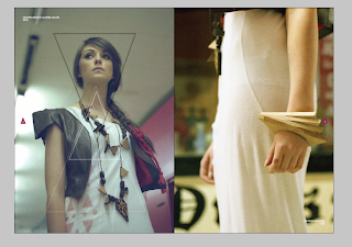
For the inside l the gemortric patterned theme had to run throughout bust in a subtile, minimal way to not take attention away form the photographs or the . It was a very simple process after editing the photos as all they had to be, was placed with garments the double page spread. However i have a tendy with my work to over crowd and complicate an iamge, but wiht this i could'nt and i had to have control.

Even at this stadge ive found this breif very rewarding, as it is  very diffrent form other breifs which i ahve been working on throughout my FMP. It mainly being image based has worked in my favour, but it has improved my layout and in design skills already.

Here are the workings on the intail inside layouts for the lookbook:


Cropping some of the imagery to make the focal point on details within the garments and on the jewelry as above shows:


Obviously the layout had to be simple and large even full bleed, below is experimenting with the arrangement of images together and compositions. For subtile geometric theme, outlines triangles and solid triangles with a light opacity have been applied over some sections of the photographs:


Very subtile, but effective not detratcing anthing away form the garments:


At this point i met up wiht my clinet and showed her the trail layouts which i had produced to gte some feedback. Overall she was very pleased wiht what i have produced and and style of the design. However she did not like the type face which i had choseen to re brand MUIR. She asked me to scrap tht one and go back to the orginal font - this was very hard to read and didnt say MUIR clearly, see below image:


This typeface was alot bolder, and had more impact and a more proffestional feel than the ohter typeface but it was less playful. Whihc was probally better suited for the young professional target market. 

Continued trailing layouts for the contents page and inside spreads. To vary the layout but also make it constant and easy and comfortable for the viewer to I should still to no more than a variation between three different layouts :


Below image dosent work, the mix of background collide togther and sit dosent sit well on the page when they are joined:


Joining both images together, aligning them so both of the shop stands meet in the centre, see below. Still not effective - white boarder is best suitable for the location images.


Subtile overlays:


This was the strongest image by far form the location shots which i was given. Lovely contrast from he shutters and the tacky mustard yellow and the garment, red dress. A effect front cover statement image:


Final cover design with a two very light triangle overlaid on top of the image, one solid and one outlined:


I was still not happy with the typeface and its readability. So I added kerning to the outlines letter forms on the M, U and R:


With the brand logo and style now finalized I had to crack on with the final lay out the spreads for both the location and studio look books:


Below, more subtile. Ootlines and shapes are not needed on both DPS's.


Layout for the back crediting page:


Back page: