
Even at this stadge ive found this breif very rewarding, as it is very diffrent form other breifs which i ahve been working on throughout my FMP. It mainly being image based has worked in my favour, but it has improved my layout and in design skills already.
Here are the workings on the intail inside layouts for the lookbook:

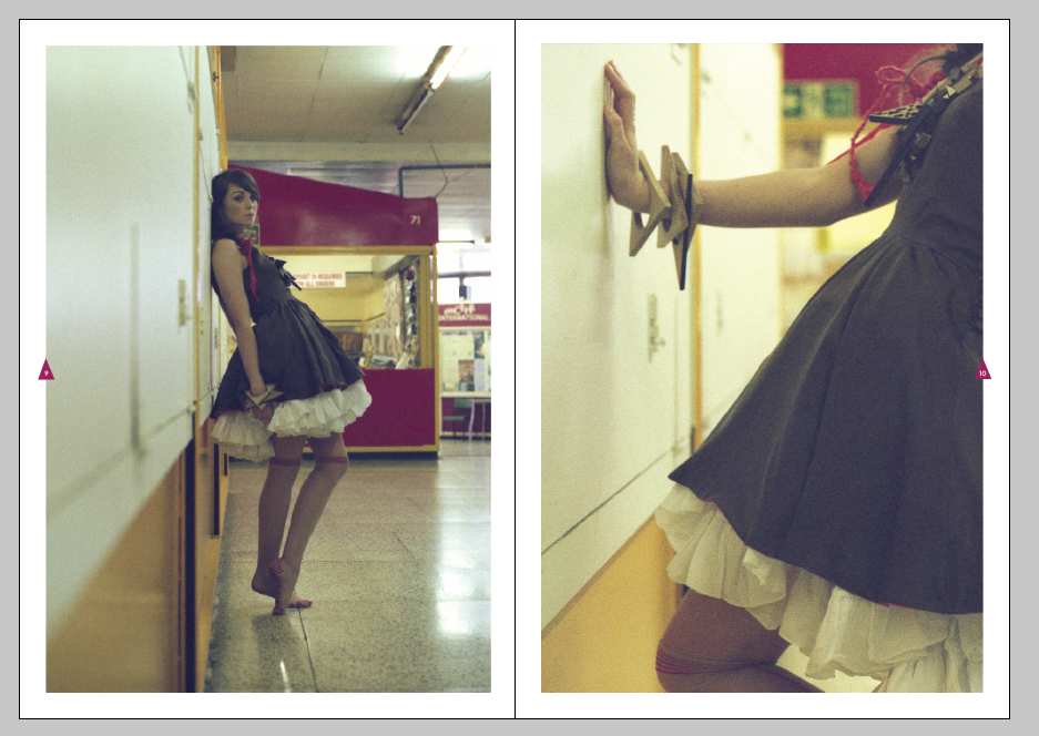
Cropping some of the imagery to make the focal point on details within the garments and on the jewelry as above shows:


Obviously the layout had to be simple and large even full bleed, below is experimenting with the arrangement of images together and compositions. For subtile geometric theme, outlines triangles and solid triangles with a light opacity have been applied over some sections of the photographs:


Very subtile, but effective not detratcing anthing away form the garments:


At this point i met up wiht my clinet and showed her the trail layouts which i had produced to gte some feedback. Overall she was very pleased wiht what i have produced and and style of the design. However she did not like the type face which i had choseen to re brand MUIR. She asked me to scrap tht one and go back to the orginal font - this was very hard to read and didnt say MUIR clearly, see below image:

This typeface was alot bolder, and had more impact and a more proffestional feel than the ohter typeface but it was less playful. Whihc was probally better suited for the young professional target market.
Continued trailing layouts for the contents page and inside spreads. To vary the layout but also make it constant and easy and comfortable for the viewer to I should still to no more than a variation between three different layouts :


Below image dosent work, the mix of background collide togther and sit dosent sit well on the page when they are joined:


Joining both images together, aligning them so both of the shop stands meet in the centre, see below. Still not effective - white boarder is best suitable for the location images.

Subtile overlays:


This was the strongest image by far form the location shots which i was given. Lovely contrast from he shutters and the tacky mustard yellow and the garment, red dress. A effect front cover statement image:

Final cover design with a two very light triangle overlaid on top of the image, one solid and one outlined:

I was still not happy with the typeface and its readability. So I added kerning to the outlines letter forms on the M, U and R:

With the brand logo and style now finalized I had to crack on with the final lay out the spreads for both the location and studio look books:


Below, more subtile. Ootlines and shapes are not needed on both DPS's.


Layout for the back crediting page:


Back page:

No comments:
Post a Comment