Paper mock up of how the EP cover will fold out;
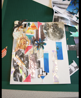
Once i had the format of the EP designed, i wanted to improve the imagery of the collage to make the miami theme clearer. So i made a new collage see below. To convey the trashiness even further i sampled soiling over photocopied images to combine them within the collage:
Sample of effect before:
I scanned this in and experimented on the coloring of the image and started to apply vectors over the image which could represent day time Miami:
Second mock up of EP cover, cut out lettering for the front cover and logo:
Back of EP design, i chose the colour blue to convey the day time of Maimi. This dosent work in my opinion, and the logo needs alot more development for it to work at its best.
Full fold out EP imagery, pulls out in sections:


No comments:
Post a Comment