Saturday, 27 February 2010

New layout for book

New proposed layout for the year book. We were given one week to refine the concept of the year book and re shot some of the sets to further our developments and insight into what the sets would look like, to give variety arangement of layouts within the publication. This was harder than we first thought getting the cooperating needed form all fo the individails and keeping to a strict time plan.

we chose to only re shot a selection of indididuals firstly, as we chose them according to there design practice given a wide scope to how each diffrent design practice could eb shot succesffuly. We asked each of the chosen to fill out a sheet, working on a square format to quickly produce a mock up to what there sets might be like:


we chose Ollie Shaw as a good example for this:


HOwever his work in the background is far too small as looses impact. Below an example of Tom Pratt:


Layouts incorpated in a new and refined version of the yr book. It was at this point where i realised that i should only be involed in the art directiona nd photograoh taking in this breif. I found it very difficult to contribute my ideas for the layout inside the book as me and Rhiannes style fo working is like chalk and cheese. She is far better at layout than me, being clean, minimal and very corporate where as i would of preferred a more experimental layout inside. However as she has much more experience at layout and so does patrick i found that anything i suggest wasn't really taking into account or trailed so it was hard to get my suggestions across.

I decided to leave the layout and inside production to Rhiann, Patcik and Annad at this point, saying i would leave this brief at the point where all sets where shot and all closes ups etc edited and ready to be placed within the layouts. i thought this was fair and they agreed.


Monday, 22 February 2010

Refining the set layout

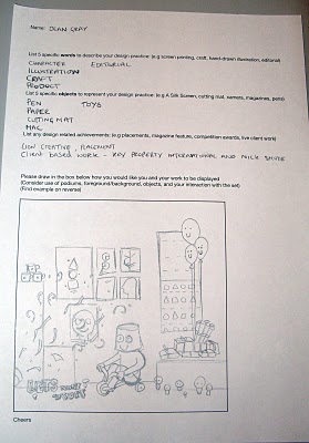
WE decided to re shoot the set deign against a white wall in studio three as thought that the impact from he studio behind the set was taking away form the impact of the set itself. Obviously we wanted to the studio into the background to represent the working environment of the class. We set up the lights and equipment and started shooting again:


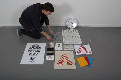
This was working far better against white than previously, now we had to enhance how the individual could be interacting wihint the set to give variety and make it playful:


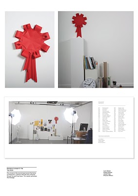
As we wanted the rosset to be a constant theme which ran inside each set representing the achievement n completing the course and graduating as designers we thought it would appriate the make the cover design d contents page feature the rosette heavily:


We wanted to be playful with how this was incorpated and decided on having a fold out poster which woudl also be the frount over design.

 However after taking this idea to the printers to see how much it was going to cost, it soon was not the best ideas anymore. it was going to cost a considerable more to produce this, however as this was still the proposal we still thought we should suggest it in the presentation:

Example of fold of poster - cover:


After we had thr forunt cover designed, it was now to propose some layouts within the book for each person;


Final presentation boards:


After the presenatation we were took that we won the chance to design the year book fully. we were thriled, however fred and lorenzo told us to scrap the concept of the award roseet in the book. they said it looked awfula dn the concept of the set along was enought to carry the breif forward.


Lighting experiments

Over the Easter holidays me, annad, patrick and rhianne set out to design the proposal for the year book. We decided that we were going to use the theme of time within a set to convey the course to the reader. We wanted to produced a set for each individual which would give them a change to present there work in a similar format to the image below and bring into the set personal object which they have used within there practice this year which conveys them and there personality.

However this was going to be a hard proposition to success with, as for the sets to work to there best potential it meant the individuals would have to co operate and be willing to put some effort/planning into there set and we could guarantee this for everyone.

All we could do though was give it a go to see what it looked like, after all this was only the proposal so we have time if we won the job to plan the set setups more thoroughly:

we soon realized when arrangement objects together with the work, that it made the set look too messy and cluttered, detracting form the impact of the work. This is an aspect of set design which could easily go wrong in the real thing if we do not consider this carefully:


Tried to control the set, with less object within it and artwork lined up and gridded together on the boards:


Photographing the set

After refining the set on how it was going to be presented we considered how the individual could interact within each set design. AS we wanted the set to be personal and to give an insight in the individual personality we thought it would be appropriate to have the individual in there own set: