Friday, 30 April 2010
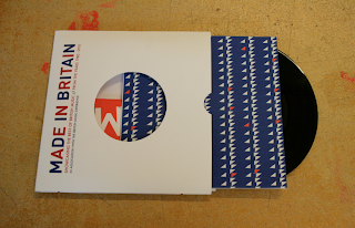
Product shots of EP Tremors + B Sides
Qucik product shots or the sleeves produced for the sample playlists for the night Midnight Mode:


After these mock up i had a crit with Joe and he suggested that i rethought the poster designs and some of the art work on the EP to make the whole set work togther better.
He said and i agreed that the Ep artwork was far stronger than the poster designs, much more interesting and me to look at. He suggested that the text on all of the postes dosent have tp be as big and it could be smaller at the bottom of the page instead, allowing me to do somehitng more intresting and unique wiht the main imagery above.
I took this into consideration and started some new sketches to help me design the layout and refinement:


Still more refine changes to made to the designs, Below the sky background is not needed on the back and a plain white background would be far more effective for the 2 EP's to works in a set:


B Side:

After these mock up i had a crit with Joe and he suggested that i rethought the poster designs and some of the art work on the EP to make the whole set work togther better.
He said and i agreed that the Ep artwork was far stronger than the poster designs, much more interesting and me to look at. He suggested that the text on all of the postes dosent have tp be as big and it could be smaller at the bottom of the page instead, allowing me to do somehitng more intresting and unique wiht the main imagery above.
I took this into consideration and started some new sketches to help me design the layout and refinement:


Thursday, 29 April 2010
Final flyer design
I have decided to make the flyers simpler with the written information on its own against a plain background. For the back design, it to be a cropped section from the original A2 poster used to promote the event.
This will enable each flyer to be different and it becomes more personal and playful for the viewer which fits in with the them of the British music experience - passing on the talent of new and old British talent.
Here are the design steps and decisions i took leading up to the final design:


Printed double sided and cut out sections:


This will enable each flyer to be different and it becomes more personal and playful for the viewer which fits in with the them of the British music experience - passing on the talent of new and old British talent.
Here are the design steps and decisions i took leading up to the final design:
Final design below:


Printed double sided and cut out sections:


Flyer designs for British music Experience Promotion
To add to the promotional packaged for this brief i have quickly mocked up and designed some flyer based on the A2 poster design. I considered cropping out square sections of the poster to make a variation of 6 different flyers - to keep my audience entertained and to give a glimpse of who the top artists where but not reveal them all.
However before i came to this idea, i thought a good idea for the background of the flyers would be cropped section the the strips of paper falling, as this would represent the british theme and not reveal ANY of the the top ten artists, leaving the audience in suspense and wanting to find out more.
I made flyer square format 14cm by 14cm, so slightly smaller than the EP cover so it could be put in peoples pockets but resembling the same format EP musical format. Here are some of the quick mock up designs which i have trailed:
Experimenting with layout and type which is similar on the EP cover, however the type blends into the colors in the background too much.

Trying to play around and make the type stand out against its background, in fitting with the style used in the poster.


Design below feels too controlled and does not reflect the caious of the poster design, too neat.


Trailed cropping into a different section of the poster and placing it as the background, i personality am more attracted to this design however it is not what i wanted to achieve as most of the artists have been revealed. The designs looks more suited for a cover design or possibility for the EP cover.

Packaging of the EP
After finalizing on the poster design for the EP which will be self contained within the EP case, i was developing how the poster could be folded down from A2 to square 16cm by 16cm format.
I did a trail run before actually creasing the final poster, placing the EP in the middle and folding around it instead of the normal in half, quarters etc making the fold more interesting for a viewer as well as more interaction with the product is required:


I did a trail run before actually creasing the final poster, placing the EP in the middle and folding around it instead of the normal in half, quarters etc making the fold more interesting for a viewer as well as more interaction with the product is required:


Nicely folded down to scale, and the fold looked interesting too!
Now it was time to fold the actual poster using the same method and folding techniques as above:


When folding I found that even cropped sections of the poster with image and text combined looked very nice, interesting as it was unsure fully what was going on but made you want to open the poster up to see what it was about.
This could be a possible idea to take the promotion further and produce mini EP sized flyers for the event.


Wednesday, 28 April 2010
Printed EP sleeve and booklet
I finally got round to printing the EP sleeve, the design was simple as i stick to a white cover design to allow full attention to be on the booklet hidden inside. This encouraged the viewer to look inside the EP sleeve and see whats in side the goodies etc:


Cut out sleeve, the circle was very hard to cut out, however ive done a good job i think and it has smooth edges:


Demonstrating how the format of the promotional EP will be and what the package will hold:


However the outer sleeve is probably too small to hold all of the promotional information as it was streching the packaging out and it looked as though it was bulging. I need to re print the outer sleeve to make it slightly bigger to accommodate the poster and booklet next time:
Final Poster development
After re shooting the final images for the celebratory poster to capture the falling strips mid air and in action, the results and contact photos are dramatically better. This was aided by using professional lighting equipment and getting more hands to help with dropping the strips for an even coverage and also using a clear single sheet white background - much better and I was extremely pleased with the results.
Below is the final photo chosen to take forward to be applied to the poster design. There was a nice even coverage of strips mid air and static. Edited and brightened up on photoshop:
JOe commented on the image i was using saying it could be even brighten on the left hand side, to go back to it and re touch it. I did this and below is the result using the dodge and burn tool:

Taking the image and placing it on A2 scale, then playing with the arrangement of text. I decide that not a lot of infomartion was needed as the web address would be present, but enough to make my audience want to find out more:


Final layout below:

Subscribe to:
Comments (Atom)


