Thursday, 25 March 2010

Final Product shots & Mock up

Before i printed the final version of the poster/leaflet i printed out a b/w quick mock up to spot if there were any spelling mistakes etc and any improvements needed for the layout:


There was a fair few things which i needed to change with the layout and positioning of the text. Below is the final product:


Above and below - final folded out poster design.

A5 leaflet listing the event information:


VIP invite, A5 leaflet/mail shot:


Wednesday, 24 March 2010

2nd Poster Shoot

Take the idea further for the mini set design for British Music Experience but this time using professional lighting and booking time slot downstairs in photography lighting studio. The results are far better and this was aided by using more hands to help with the scattering of the strips of paper.


I shot all of the photo's on RAW as well as this would give me more of choice when manipulating the imagery in photoshop in achieving a clean crisp white background:


Shots was capturing the moving strips of paper far more effectively:


Photos with only a little bit of falling strips were the most effective. Too many strips mid air detracted form the cut out figured below and made the shot look too messy:


Monday, 22 March 2010

Layout development for poster/leaflet

Initial design for the leaflet for the promotion for the end of year show publication. This was the first time which i have actually trailed and used Indesign for a brief so this gave me good practice in using the program. It was fairly easy to maneuver after a few attempts and i am pleased with my progress.


Inserting the background picture of bursting through mini triangles, nice effect created. Type still needed to be altered to fit in against it.


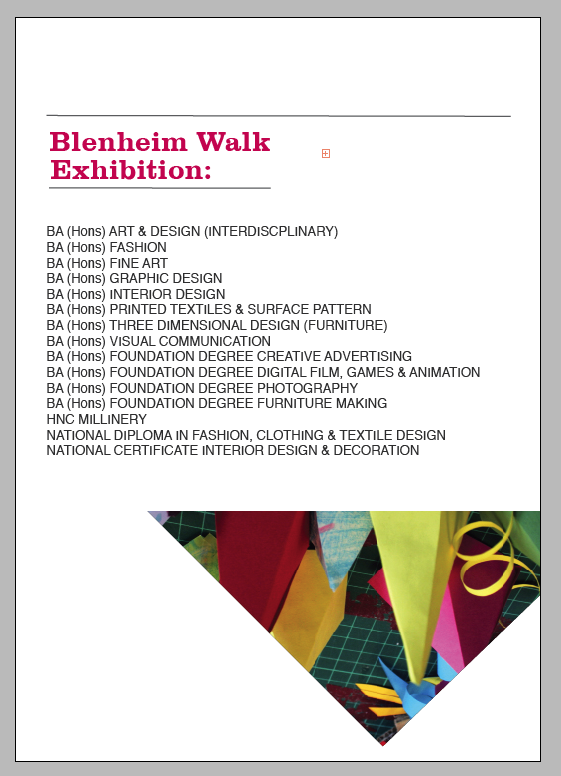
Final poster designs after selected the fully burst through image:


I was going to print the leaflet/poster doubled sides allowing the exhibition information to be contained on the other side of the poster, folding it in a way then that i can be contained in a leaflet A5 format.

her are some on my initial layout designs for the leaflet pages. As there was not much text to work with it meant the pages could be fairly minimal working to my advantage:


Starting to look at bit moe comlete and asethictlly pleasing for the cover design of the leaflet:


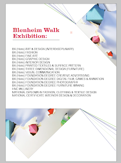
Inside page designs:


I wanted the inside layouts to be playful, not heavy on the eyes and interesting to maneuver around. Each page was differently designed by either a different cropped section or using a different filled in shape: