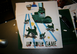
I made a very quick collage on photoshop similar to the designs which i set out make the collage previously. I arranged all the images on one single sheet of A3 and positioned them in order of height which would allow me to cut them out and work in a hierarchy when standing upright/popped out.
Here was the mock up, still very girly and not overly targeting for the male audience which the brief asks. This was a difficulty which i have found very hard working on this brief, as it asks for the campaign to not be overly sexual and it didn't want to produce design work which was the standard 'larger lads" form.
The mock u design looks very tacky and cheesy - which is not the desired effect and as i said above it looks girley. However as i cut out and folded the card cut out pieces, the overall effect is very pleasing and visually exciting:


This idea needs to be refined and designed more for the male audience, consider colours and imagery. Maybe use a black background and women dancing? But this goes back to the designed being overly sexual. During this brief i feel like i have gone round in circles.


No comments:
Post a Comment